Thursday 28 November 2013

Designers of the Digital Print


Peter Pilotto


This sort of design really make you think about the layout of your pattern and how it will look on a person. Although she has a nice figure to begin with the dress makes her bust look bigger and her waist slimmer. 
Beautiful.


What I really love about this dress is the simple focus on Scale. The Tiny print combined with the massive ones makes a really interesting effect.


I really love the rough patched up look with this design and how strong the material is. And it gives her a good figure shape.


This one looks like you're walking down corridors, really cool and weird. I think it's a good idea to have the vanishing point in the centre of the design for the waist it makes her look smaller.


This design is very similar to the one seen above, except this is far better fitted for the figure. I really love the colours.


Another design that appears to be vanishing off into the waist. Although, this isn't one of my favourite designs it does show a lot of careful planning and clever use of constructive techniques that catch the eye. 


This was one of my Favourite designs being a combination of sharp industrial looking shapes and the soft swirls of plant-life. It creates a very fascinating piece of wearable art.


What I like about this dress is that you can see a very obvious repeat design in the flowers/leaves and can see them very well, but they haven't been allowed to block out the models figure with all that orange, blue, and Black. Instead Peter placed a very simple design over the top to prevent the dress from being to overpowering. 


Here are some pictures of Celebrities wearing Peter Pilotto's designs.


This is a picture of Peter Pilotto on the right with a model showing off some of his work. I don't know who the other guy is. 


Thank you Peter Pilotto, for all your great work. It truly is inspirational.


Monday 25 November 2013

Art Deco Pictures


I love the art that was made for the Art Deco movement. This piece especially is great. The perspective and choice of colours makes you feel like you are looking up from inside a building or a car. 

Gold on Black is always going to be a winner. It just looks so pure and royal, Brilliant and clean.


This is another example of a perfectly mirrored image. I like how the designer has used very earthy colours and combined the coloury opposites; Black and yellow, Green and red?... I'm not sure what shade that is?


This is an Art Deco Fan Easel by Jean Hall, I love how it all works so when together, both the Repeats and the layout.


I love my cushions, and I love to make them, but this is Art Deco and a cushion. Win win. Although, I think if I was to make a design like this. I would use a bit more colour.


An Earing made of beads. It might be a bit heavy, but it's a good idea. This would look really good repeat and sewn onto a bag.

I don't know why this is the case, but whenever I see Art like this I feel as if I have walked into a book. It's a very cool feeling. I like the differences between the thicknesses of line and the combination of shapes.


An art Deco hair comb. Truely beautiful. I can't imagine having it in my hair, but it would be interesting to give it a try.

 I like the simplicity of this image unlike the others this one doesn't seem to have a flowing shape or consistent pattern other than Triangle. But it looks pretty cool. I couldn't find the artist.

One glance at this picture and that was all it took for me to stop what I was doing and just stare for a while. The Colours in this are breathtaking, and really pretty. I could make something like this in photoshop as a print, or I could hand dye the fabrics and sew them together, or use a combination of oils and prints. It's really structured, but it has a wacky and wonderful layout.


One look at this and I thought 'Great Lace card' I wonder if I could make that on the Laser Cutter. I might give it a try, or at least something a little bit similiar.


And finally to finish with another Art Deco Fan. These are just stunning to see up close, but when you take lots of pictures of them and repeat them they're even better.

Wednesday 13 November 2013

GROUP REPEATED PRINTS

Our Repeats.


Our iniciual design idea for this came from Sally-Anne drawing of a circuit board. And from there we decided that it would be an interesting idea to have a length that was based on an electric theme.


This is when Sally-Anne, Amy, and I worked on the repeat design on codertrace. Making sure we coloured in the areas with dark opac colours as possible.


This was to be our first print layer.


And this was to be our second.


We were finding it hard to decide on what sort of colour ways that we should use for this print so I took a few pictures of the trace and played about with the colours on photoshop.
Someone first initially said that they thought that green and red would be a good colour choice, but when they saw it printed they decided that it was as good as they had hoped.


Everyone seemed to prefer this colour range. And that inspired us to look into Constructivism. 


Although a lot of my playing about didn't aid much to the project. It did give us a better understanding of how we visualised our work and how it might eventually look.


Us testing out and getting the right dyes.


Our fabric length. Getting ready for printing.


Measuring the distances needed for the screen printings.


Taping down the fabric length.


Our first two prints.


You can see the repeat more clearly now.


The final colour combination before steaming.


Repeated Prints.


What I like most about doing research on repeated prints is that you really can find them anywhere. The repeat print above is one that I designed on Photoshop. Although it isn't as grand and beautiful as some of these others I have recently found it was a fun starting point.


A lot of inspiration for new work, as we all know, comes straight from books. Most commonly found at the library, or bought for your own personal use. This one in particular I have found to be continually useful for ideas to be used in screen printing. I have found that a lot of people when designing their own pieces of work tend to like have their background as a solid colour, or an obvious landscape design, where you can see the image has been designed with perspective in mind. However these two images haven't. 
The image above has a very fine and delicate repeat print over its surface, but that is not what the viewer first sees when he glances at this image, he sees the background. The painted stripes gives the image a far more vibrant and visually interesting perspective. Having the paint stripes go horizontally, and the print going vertically the image becomes less of a print and more of a pretend weave. 


What I found to be visually interesting about this image is its pattern blocks. It isn't divided up into different blocks of colour. It has been separated into sections of pattern, and the patterns have been designed so they set off the foreground pattern. I also love the colour choice.


I thought is picture had a very retro feel to it. And although this looks very much like a one off that someone took a long time to do. I can see it becoming a fabulous repeat. 


Turquoise and Violet, utterly beautiful. And although at first glance you might start to wonder whether the colours would have worked well together, or whether it would be better to use something else. I thought about this, but then decided that it was quite breathtaking with such contrasting colours.


This picture made me think about the importance of layout and design. Do you cut out the picture and then draw on it, or do you draw the picture and then cut it out. This bag has a spring-like colour swatch feel to it. It is very visually interesting.


This picture made me reavaluate what I thought was important to have in an image. Things that I would have thought couldn't go together have come together in this, and has made the picture better because of it.


This continues to show me the importance of textured backgrounds.


This image shows me the value of layering. What gets laid down first, and why? How does one layer effect all the others laid on top of it?


And although I'm not allowed to draw on my walls at home, I can most certainly say I like the idea, and love this work. I can really appreciate the beautiful simplicity of these patterns and how they add depth and playfulness to the layout of the room.


Here is another example of careful layout. From a distance it looks like white leaves on a red background, but when you're up close you can tell that both colours have different patterns in each of them. The leaves having spots and the background red having lots of tiny flowers.  


The strength of colour is what drew me to these pieces. I love the idea of layering everyday boring items onto exciting and stunning stripes making both the stripes and the print look better.


I also looked into book coverings made primarily in the Art Deco period. Their eyes for detail and repeated or mirrored pattern was simple and visually lovely.


Although you can't see it so well in this image the dotted swirls where actually embossed into the leather, and they were filled with a sparkling gold.


What I found most impressive about these designs was the fact the book was complete unless it was open. Until you had laid it face down you wouldn't be able to see the beauty of the overall design.


This one really shows you the importance of pattern design. Whether you create a pattern in the background or fill it in block colour. And to always consider the importance of texture.


I didn't think I'd be so influenced by repeated imagery, but when you start seeing a pattern come come together through such simple means it's hard to stop working on it.


While doing this research I have decided that although some imagery looks great with lots of colour it is best to start simple and straight forward, and keeping your colour ways small and sophisticated.


Even subtle changes in a repeat can make a bad or boring repeat into something quite extraordinary.


I have decide to make a habit of comparing and combining my work with other peoples. Then I can see what truly makes an image. 


At first glance, I thought print for a castle, or at least fashioned with an old style theme in mind.


Bright blue and yellow. Although not commonly easy to paint together, but printing is another matter. I don't really like the star design, but the layout is very good.


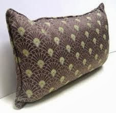
What I loved most about this image is the wavy textual piece. It would make a great repeated print.